Choosing a font for your design seems like an easy task, however, all too often we see designs that do not match the aesthetic of the fonts. We have compiled a few basic tips to keep in mind while designing and choosing your fonts.
Check Your Brand Standards
Before diving too deep into font selection, make sure the company you are designing for does not have a brand manual. If they do, most likely the font selection has already been established for you. Some brands can be very particular about which fonts are used for headlines and body copy, giving you little room to be creative with fonts. If this is the case, it is imperative to stick to the fonts selected for your brand.
Bonus: Learn more about the importance of a brand manual HERE.
Understand Font Classification
Fonts can be broken down into 6 main font classifications. Each classification gives us an understanding of how those particular fonts can be used.
Serifs: These fonts come from the Latin alphabet. They get their name from the small strokes attached to the top and bottom of each letter. Many designers also refer to the strokes as “feet”. These are considered to be a more classic, traditional font. Serif fonts can work for both headlines and body copy. When using serifs, try to stick to just one. Using more than one seif font in your artwork may cause confusion in the design.

Sans Serifs: The word “Sans” literally means “without”. So a Sans Serif font is “without” the serif, or without the “feet”. These fonts tend to be much more popular than serifs because they can give a clean, modern overall look. Sans Serif fonts also can provide an easier read. Sans Serif fonts work very well for both headlines and body copy. Some of these fonts are available in large families, making it to mix and match. For example, maybe your headline is Nexa Black, but your body copy is Nexa Book. Play around with family combinations, but it may be best to limit yourself to 2-3 variations.

Slab Serif: This is a much “chunkier” font. While they have the top and bottom strokes, slab fonts are more blocked with mostly squared edges. These fonts don’t normally find themselves in long body copy but work well for short headlines.

Script: These fonts tend to look like a fancy, cursive handwriting. Some script fonts will be more formal than others, but all tend to be quite unique. It is not recommended to use script fonts for body copy. Use scripts sparingly, only for very short headlines or accent words, because too many script letters together can be very hard to read. And make sure having a fancy font makes sense for your design. Script fonts are traditionally found in designs like wedding invitations and more feminine subjects, although you may find some designs appropriate to use a script font to stand out in a masculine design too.

Decorative: These are also known as ornamental or display fonts. They were very popular during the 19th century and used for many poster titles and advertisements. Decorative fonts can be fun for some types of logos and headline fonts. They tend to have very specific themes and we suggest using them sparingly.

Handwriting: These are fonts that look exactly like that… handwriting! Whether it’s cursive, print, graffiti, etc… if it looks like a person may have actually written it, the font will fall into this category. As with Decorative fonts, make sure it makes sense to use handwriting fonts. These tend to work best in casual designs, rather than in a formal setting.

Tips From The Designer
Really think about the message you are trying to communicate and who you are speaking to. Some audiences will need your fonts to be large and extremely clean. Others will enjoy and find relevancy in a decorative or script font.
Limit yourself to two fonts per printed piece. Choosing a specific font style can change the look and feel of your printed materials and the message you’re trying to convey. Choose different fonts to make the content more visually appealing. Using contrasting font styles can help make a strong statement as well. For example, use an eye-catching decorative font like Luna or Manafesto for your title or headline, and then make sure your body content is easily read by choosing a sans serif font such as Gotham or Nexa.
Where To Find The Best Fonts
If you are using Adobe products, we highly recommend using Adobe Fonts. You can browse font options, turn them on and off right from the website, and they are available for anyone on your team to use. Making sure everyone has the same font files can be difficult, so Adobe Fonts has streamlined that and made the process so much easier.
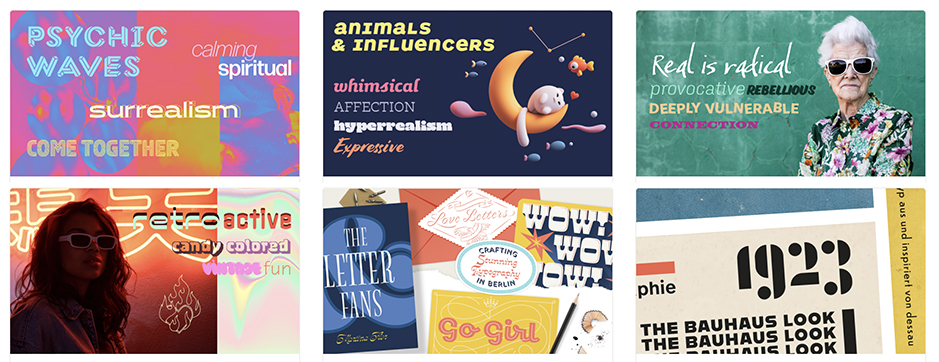
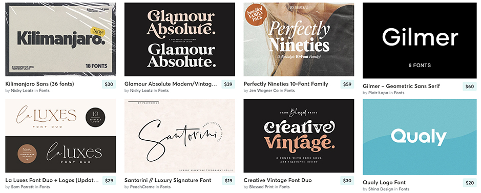
If you are looking for something very unique and not available to everyone, we recommend Creative Market and Letterhead Fonts. Both of these are paid sites, but offer beautiful fonts that you won’t see elsewhere. This can be specifically important for logo creation. It isn’t as important for body copy to be one of a kind. But logos and header text will make a bigger impact if the fonts are unique and truly represent your brand.

Best Fonts for Print
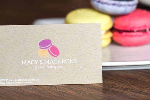
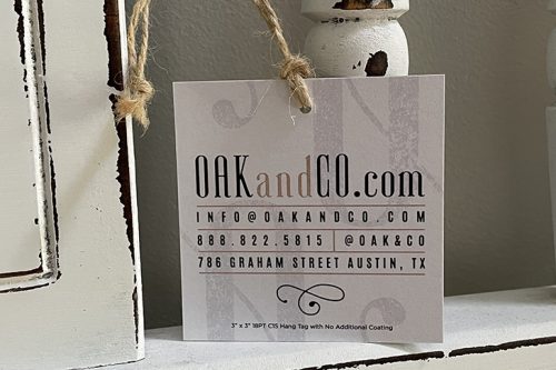
When designing and printing business cards or other marketing materials, be mindful of space. Some typefaces are fat and full like Franklin Gothic and will take up a significant amount of space. There are times when there isn’t a lot of space available and including these fonts may be challenging. Other fonts can be thin and narrow such as Didot and can be a better choice when there is little space. The information on your printed piece is generally the primary focus, and it’s key to making a lasting first impression. Make sure that the fonts you choose are both visually exciting and comprehensible to your audience.
Looking to find free fonts? We’ve listed a few sites that offer free fonts for download.
For general questions or information, please contact us or start a chat on our site. If you have questions about our graphic design services, please fill out our contact form on the design page and one of our amazing designers will get back to you shortly.
