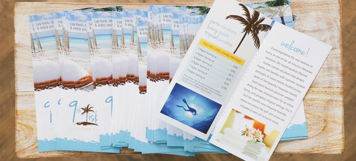
Businesses, large and small, have used brochures to illustrate products and services for over a century. Even with the increase of technology, and the ease of relaying information, printed brochures still stand as a highly effective marketing tool.
Printing brochures are a great way to give potential customers something they can physically hold and take with them. You can distribute them easily while attending a meeting, conference, trade show or place them on a counter or table.
Attendees can look it over whenever it is convenient for them and have the ability to come back to it as often as needed. There may be an instance that someone may be on the fence about a company and browsing the brochure multiple times can help decide on whether or not to use them. So, that’s why having a strong brochure design important, and why having the right content is essential.
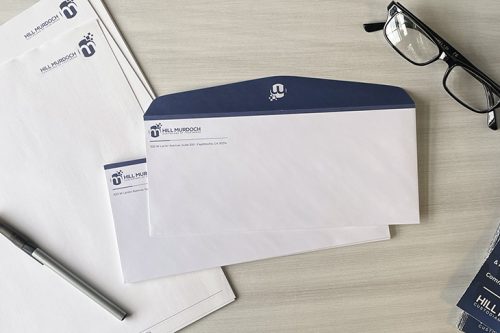
Each printed piece that you put out to your customers is an extension of you, your brand, and your business. Poorly designed brochures may make the customers think twice about what you have to offer.
Here are a few recommendations and tips for improving your next brochure design:
Keep It Simple
Unlike sales sheets and one-pagers, brochures are intended to give an overview of a product, business, service, or event, and not necessarily to include all of the details and process. Touch on critical points and then create a CTA (call-to-action) directing them to contact you or go to your website for a more in-depth look.
Follow Your Branding
Make sure the design follows the brand guidelines your company has set. By doing so, this helps with brand recognition and keeps all print and digital marketing pieces cohesive.
Know Your Audience
When collaborating on the design concept, make sure you think about who you are speaking to and write the text that will resonate best with them. Make sure you include a clear call to action, so they know how to contact you, as well as the next step in moving forward.
Limit Your Topics
It can get confusing when you try to cover a wide range of topics. Try to narrow them down and maybe create multiple brochures for each area of your business.
Show Off What You Do
If you can use actual photos of your products, that is best. Stock photography is a great tool when needed, but showing real people, real projects, and actual results will make the most significant impact on your customers.
It also presents a sense of accountability for what you say you can achieve. Just make sure your photos are of high-quality, and it’s always recommended to hire a professional photographer whenever possible.
Mix It Up
Rather than just putting all of your information in paragraph form, think of other ways to present the text. Charts, graphs, and infographics are a few examples of how you can add a little variety.
Bullet points have been proven to grab the attention of readers. It not only highlights important points and details, but it also makes the piece easier to read.
Think About Your Folds
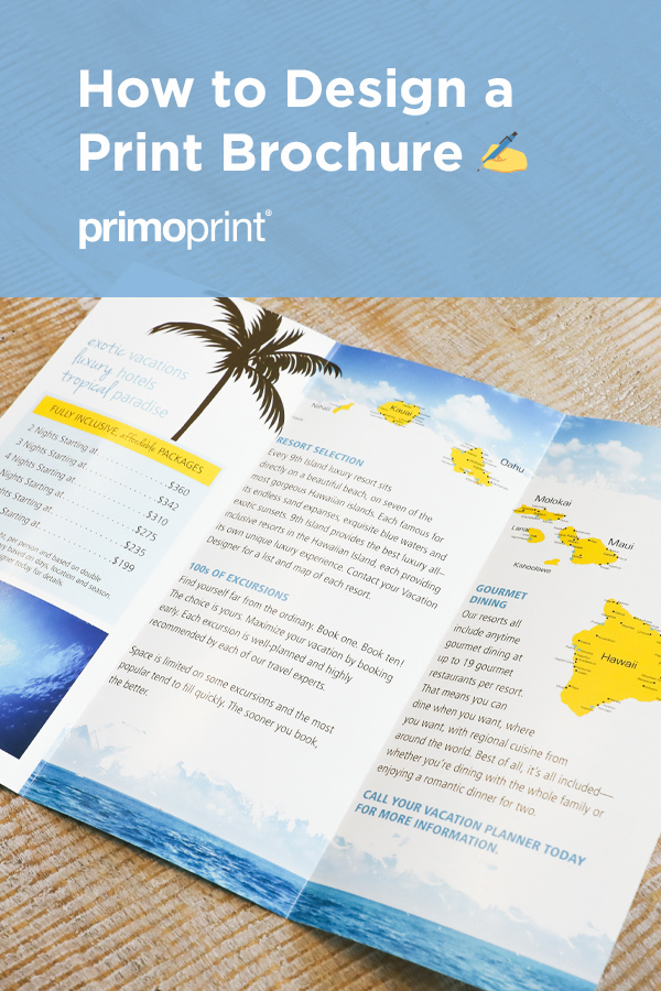
Whether you are doing a standard tri-fold, gatefold, accordion, etc. it’s important to think about how the brochure looks at each point of unfolding. If your text goes across two panels but has a flap that can lay over half, that can be hard for the reader to understand where to look.
We offer a large variety of folding options to meet your marketing needs. Some of our most popular options are listed below. View information on our available brochure folding options.
Tri-Fold or Letterfold:
Three-panel piece has both side sections folded inward, one on top of the other. Each panel is ⅓ the length of the brochure.
Half-Fold or Bi-Fold:
Folded in half.
Gatefold:
Both sides of an oversized page fold into the gutter in overlapping layers.
Accordion Fold:
Divides your brochure into panels that fold on top of one another.
Z-Fold:
Back and forth folds that create three panels. Each section is ⅓ the length of the printed piece.
Roll Fold:
Fold where the page is folded inward at one end and then folded inward again one more time as if you were rolling the page up.
Creating useful marketing tools is an investment. So take the time to make sure this investment is thought through. When designing something that is not only beautiful but functional, you are creating an experience for your customers.
Looking for brochure design inspiration? One of our favorite places to find design inspiration is Pinterest. Check out a variety of trendy and modern brochure designs here to help get your wheels turning.
If you need help with your brochure design, the graphic design team at Primoprint is always available to assist. Contact us today for a quote and to begin the design process.


