Before we get started on the design elements of a sell sheet, we must answer – what is a sell sheet?
Well, they are also known as a product sheet, which is a one-page form of advertisement for your business, brand, product, or service. In today’s digital world, sell sheets can be an essential marketing tool when you have something to sell. Whether it’s for a real estate agent selling a home or a new entrepreneur trying to get resellers to pick up their new product, sell sheets, and product sheets are practical and can get your product from “for sale” to “sold.”
Below I’ll discuss how to get started on your sell sheet design. When creating your layout, there are a few things to keep in mind.
Selecting the Images
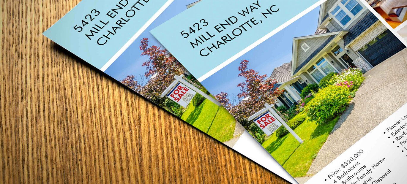
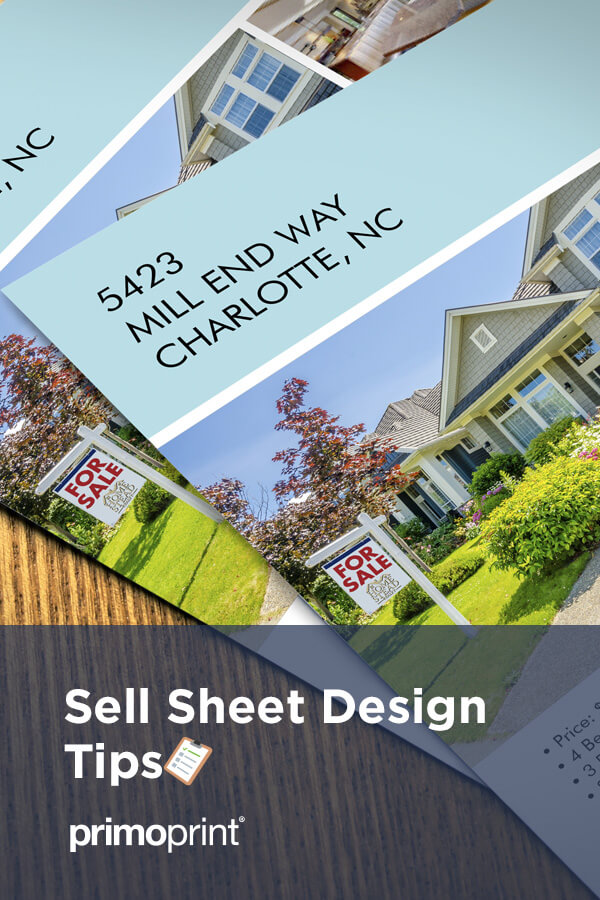
First, make sure you have the best product images possible. In the design world, we call it a “Beauty Shot.” The beauty shot is known as the large photo, which is the focal point of the sell sheet and can spark emotion. I highly recommend that you invest in either a professional photographer or an illustrator to produce this. Having a large, clear vision of your product may be the most critical element of the sell sheet. This can create an increased desire for your services and products.
32% of marketers say visual images are the most important form of content for their business. via Social Media Examiner
We understand it can be challenging to find great photos online. So, we’ve listed 28 of the best sites that offer free stock images.
Include Graphs and Charts
Along with having great images, including graphs and charts, are great visuals to highlight areas of your business and products. You can easily compare your products and prices to your competitors. Rather than telling them, show them with a visual.
A recent study found that people tend to remember only 20% of what they read, while about 37% of the people are visual learners.
Create a Great “Bold” Headline
Next, command attention with a headline. This is one sentence that will grab the viewer’s attention and say what this product or service will do for them.
Adding a great headline makes a compelling promise to your audience. Your content simply delivers that promise. To help the readability of the sell sheet, make sure you include a few bullet points that list some of the features and explain why they need this product.
How will it benefit the viewer? What makes this product different than those that are similar?

Logo and Information
Keep in mind, if you include too much information too soon, it can put off a prospective buyer. So, it’s crucial to add your contact information and logo. Keep the logo reasonably small in the bottom corner. Your contact information can go next to the logo. Make sure this is large enough to read, but not so large that it over-powers the product you are trying to sell.
Another thing to keep in mind, if you want to use additional images, make sure they are also of good quality, and I’d recommend making them smaller than your beauty shot. This will allow you to show different angles or uses, but won’t take away from the focal point of the sell sheet.
Including custom, text boxes can make it easy to arrange the copy, which allows it to stand our similar to graphs and charts. By using white space, it can ensure your prospect’s eye is drawn to the text you want them to read.
Design Considerations
During the letterhead design process, you’ll need to think about the following to include:
- Product or Service Details
- Business Logo
- Unique Title
- Short Paragraph or Descriptions
- High-Resolution Photos
Include a Call-to-Action
Now it’s time to funnel the flow of the customer. No matter what you are selling or promoting, you should always include a CTA. By adding a call-to-action, this can help take the guess out of their next move. The CTA can direct the customer to a landing page, a specific product page, or an ordering page. Use terms such as “learn more, ” ” call us to learn more,” and “get started.” The primary goal is to have potential clients and customers interact with your business.
Whether your CTA is registering for a free demonstration, redirecting them to your website for more information, schedule a call, it’s critical to have your prospects moving in the right direction and interact with your business. But, make sure that the CTA’s aren’t “pushy,” but clear about the next move if they decide to use your product or service. Most importantly, easy to read.
I heard a marketer once say that your sales sheet should do the selling for you. So let this marketing piece do the talking!
You’ll want to make sure that your well thought out sell sheet design convinces the potential customer that you’re not only a professional, but that your business is credible.
And if you are not a graphic designer, you can look into hiring one. Your strengths are with your product, while a designer’s job is to make your product look good. Contact one of our in-house designers by completing the online graphic design form. This small investment can take the sell sheet to a new level.
Visit our gallery to see sell sheet examples, including custom designs.
