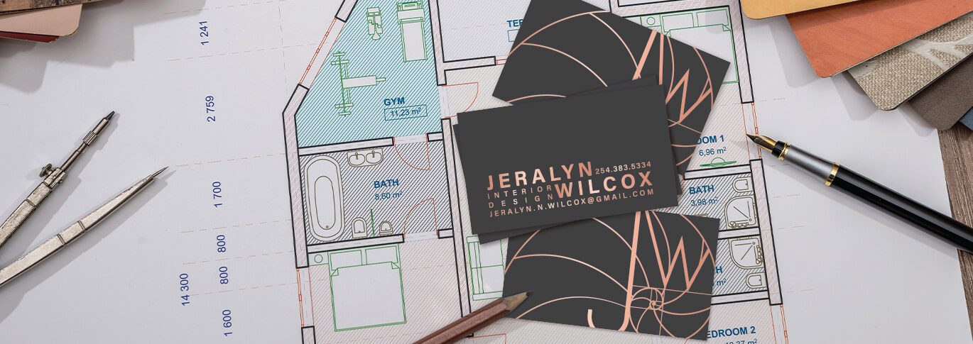
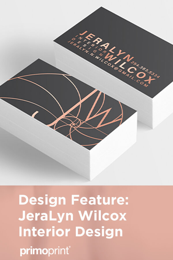
Our graphic designer Kelly created a vector version of their logo, custom-designed business cards, greeting cards, and envelopes.
Background
JeraLyn is an interior design student and needed a few things created to help her job and internship applications stand out. She was interested in our rose gold stamped foil and wanted to incorporate that product into a few of her pieces.
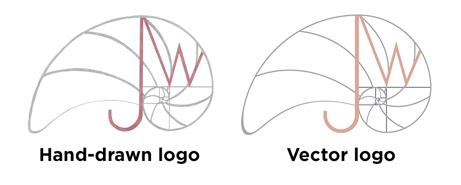
She was looking for designs that were “memorable and classy without being stodgy or traditional” and stated that her “design aesthetic leans towards clean, modern and colorful”. Along with the printed collateral, she also had an existing hand-drawn logo that needed to be recreated in a digital, vector-based format.
Logo Design Process
I started with recreating the logo and adjusting the color scheme slightly to better match the hue of our rose gold stamped foil since we knew that was going to be a driving force of her printed branding.
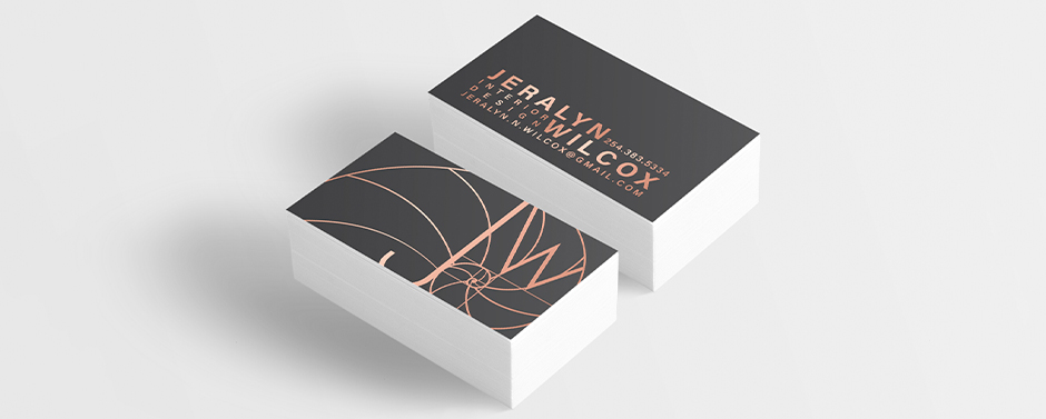
Once I had approval on the logo, I put together some concepts for her business card. The layouts played with space, texture, and contrast a nod to the principles of JeraLyn’s interior design services. We decided to go with a unique presentation of her contact information and an oversized logo on the back. The text and logo are done in stamped foil on a dark charcoal background with silk lamination for a dramatic and luxurious final product.
Next, we moved on to her greeting card design. Since the business card, though impactful, was quite simple, I decided to add a few more elements to the greeting card design. It’s important to keep the size of the final product in mind when brainstorming designs. Small items, like business cards, are often more powerful when they stay minimal.
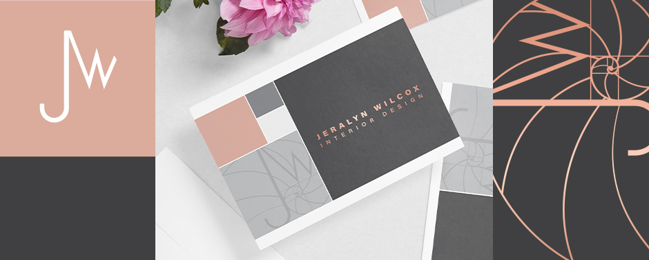
With a greeting card, we have a little more space to work with, allowing me to incorporate more complex ideas without feeling crowded. JeraLyn’s logo is based on the golden ratio, which I mimicked in the layout of the colored boxes. We decided to use stamped foil and silk lamination on this product for a higher-end look.
JeraLyn wanted to have custom printed envelopes to compliment her greeting card. Looking at her designs as a whole, we had a dark piece (business card) and a more complex piece with a good balance of light/dark (greeting card).
We played around with a few options and ultimately decided on a simple white envelope with a thin band of grey and block of pink, which are lighter versions of colors used elsewhere. I also included a thin line across the bottom, an element pulled from her existing stationery and resume designs.
We also designed some simple return address labels and envelope seals to give the whole package a really finished, polished look.
Let us know what you think about the designs.
If you’re looking for a custom design or rebranding, our design team can help. Get started by completing our online design form.
