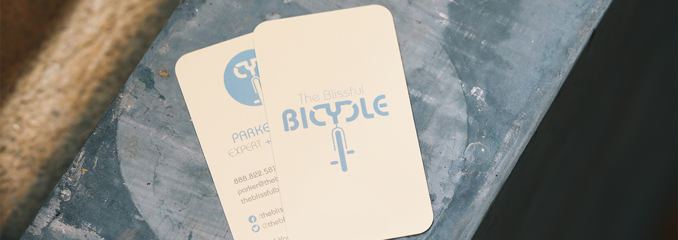
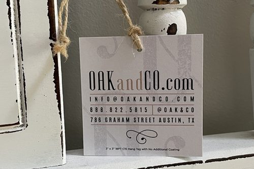
Your business card may be the last impression you leave on a customer after your initial meeting. Statistics show that only 7% of your first impression has to do with the words you say, while 55% is all about visual. This includes how you look, your handshake, and eye-contact. Make sure your appearance stands out, so when handing out your business card it truly represents you and your brand.
A great business card design clearly conveys all the important information necessary for someone to reconnect with you. Make your first impression count as 90% of the business cards get forgotten within a week.
Creative Business Cards
So, you’re wanting to print creative business cards. You can design your own business cards or have a graphic designer who specializes in designing logos other personalized components necessary to present your image in a cohesive and professional manner. Whether you’re designing them or hiring a designer, below are some basics you will need to focus on with your business card design.
Card Stock and Colors
Start by choosing a sturdy card stock that will fit into someone’s wallet or card stock that is tear-resistant and prevents chipping along the edge of the cards. Take a moment and decide on whether you want the finish of the stock to be glossy, matte, or textured for you and your business.
Resource: Matte Card Stock vs. Glossy Card Stock
They are available in a variety of sizes, allowing you to pick out a card that is as unique and distinctive as you are. You don’t have to select the standard 2” x 3” business card, even though they may not be able to easily stored as they are bigger.
Printing a magnet card is another popular choice, especially if you are in a service industry, such as appliance repair because the card will always be right there on the face of the appliance for easy access. They can easily hang around to keep customers familiar with your services.
If you truly want to make a great first impression, selecting a thick business card or edge painted card can do the trick. They are printed on 32PT thick card stock with a large selection of edge colors including black, green, yellow, and more.
Select the color of both the background and the font. You will have to play around with this by superimposing text over a background. You can easily do this on most basic word processing programs using the available color wheels to create backgrounds and texts in a variety of color options. You want your colors to work well together, not to clash.
If you don’t have an eye for color, ask colleagues or friends to offer opinions. Stick to just 2 colors if possible. If you already have a logo, that should be your starting point when choosing colors.
Font Selection
Once again, if you already have a logo, try working with the fonts on the logo as a starting point. Otherwise, go back to your word processing program and play with the many fonts available. Make sure that the font you select is very easy to read. It doesn’t matter if it is serif, sans-serif, or calligraphic. It just has to read well. You don’t want someone to have to ask you what a word is because the font is too elaborate or whimsical.
Business Card Sizes
There are a variety of business card sizes to choose from. You have the option to select from standard, square, oval, mini, and European. You can learn more about each business card size by reading our blog: What are the Most Popular Business Card Sizes?
Printing Options
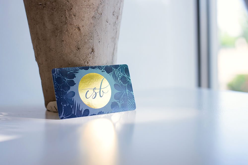
There are a few printing options to enhance the look and feel of your card. You can select foil stamping, which is a method used to inlay a metal finish into the text and image areas. Popular colors for stamped foil include silver and gold. Another popular option can include Spot UV which is great to highlight a logo, image, photograph, or pattern.
An inline foil is a simple and affordable way to make your card stand out from the crowd. You can turn a wide range of CMYK colors into multi-colored foils.
Business Card Information
All the important information needs to be included in the front and center on the card’s front. Sometimes having a clean and simple design is better than a card full of information, making it difficult to read and understand. Try to include the following in the design:
- Name, include the title if appropriate
- Company name
- Phone number
- Email address
- Website address
- The physical address, only if relevant
- If the business is active on social media, you may want to include the accounts on the back.
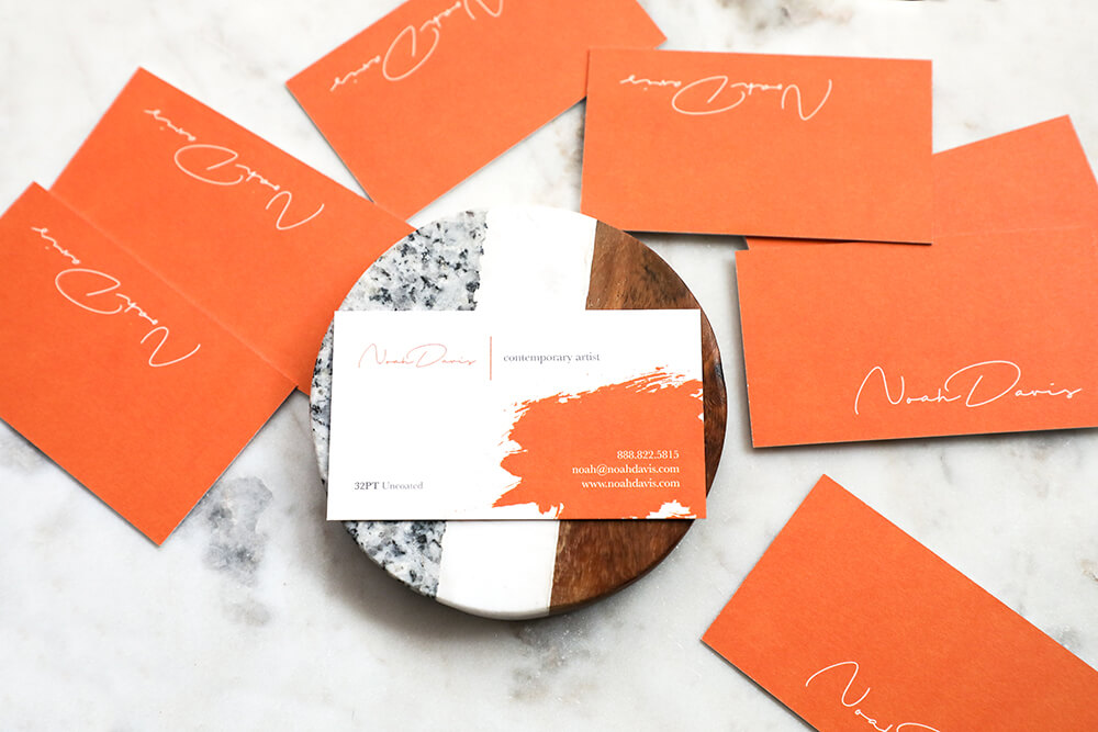
Try not to clutter the card with too much information.
When receiving a business card, look at it closely. Make note of what impresses you about a card and what leaves you bewildered. One of the most important jobs in designing a business card is to engage your audience and to leave a positive impression.
Plus, they need to be done creatively, and they concisely must tell someone exactly who you are and what you do.
