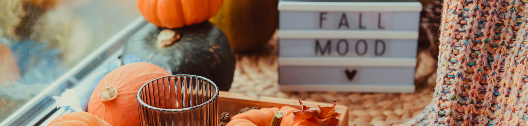
As the seasons change, so do the colors that inspire design trends. Fall is a particularly beautiful time for designers, as nature offers a rich palette of warm, earthy tones that evoke feelings of comfort and nostalgia. The colors of autumn—think deep oranges, rich reds, golden yellows, and earthy browns—are perfect for creating designs that feel warm and inviting. In this blog, we’ll explore how to incorporate fall colors into your design projects, whether you’re working on a brand, a website, or an interior space.

1. The Power of Fall Colors
Fall colors have an inherent warmth and richness that can transform any design. These hues are not only reflective of the changing leaves but also symbolize warmth, coziness, and comfort—qualities that many of us seek as the weather cools down. From a design perspective, these colors can help create emotional connections, making them perfect for projects that aim to evoke a sense of nostalgia or relaxation.

2. The Key Fall Colors
When thinking about fall colors, certain hues instantly come to mind. Here’s a breakdown of some of the most popular shades and how they can be used in design:
• Burnt Orange: This deep, rustic orange is a quintessential fall color. It works beautifully as an accent color in web design or as a focal point in interior design, adding warmth without overwhelming the space.
• Mustard Yellow: A muted version of yellow, mustard tones feel more sophisticated and grounded than their brighter counterparts. Use this color in typography, as a background, or in patterns to add a pop of fall cheer.
• Cranberry Red: Rich, deep reds are reminiscent of fall fruits like apples and cranberries. This color brings a bold, dramatic element to designs and pairs well with neutrals like beige or grey.
• Olive Green: Olive tones offer a subdued, earthy green that’s perfect for grounding a design. It works well in logos, packaging, or as part of a natural, organic color scheme.
• Chocolate Brown: Brown tones are often overlooked in design, but in the fall, they shine. Chocolate brown is an excellent alternative to black or grey, adding depth without being too harsh.

3. Applying Fall Colors in Different Design Mediums
Fall colors aren’t just for seasonal marketing—they can be incorporated into various design projects for long-lasting impact. Here’s how to use them effectively:
Graphic and Web Design
In digital design, fall colors can make a website feel more approachable and user-friendly. Consider using warm hues in buttons, call-to-action banners, or as part of your background imagery. Gradients incorporating fall tones can add depth and visual interest, while subtle use of these colors in typography can create a welcoming experience for users.

Branding and Packaging
For brands looking to evoke trust and reliability, fall colors are a natural choice. They suggest stability and tradition, which is why many heritage brands lean into these tones. In packaging design, fall colors can make products feel artisanal or handcrafted—perfect for food products, beauty items, or home goods.

Interior Design
Fall colors aren’t just for graphics—they’re perfect for interior design, too. Adding accents like throw pillows, rugs, or artwork in fall tones can instantly warm up a room. Even a small pop of burnt orange or cranberry red can make a space feel cozy and inviting.

4. Balancing Fall Colors with Neutrals
While fall colors are undeniably beautiful, they’re also bold. To keep your designs from feeling too heavy, balance these warm tones with neutral colors like cream, beige, or soft greys. This creates contrast and allows the fall hues to stand out without overwhelming the viewer.

5. Final Thoughts: Creating Emotional Connections Through Color
Design is about more than aesthetics—it’s about creating an emotional connection with your audience. Fall colors, with their warmth and richness, naturally evoke feelings of comfort and nostalgia. Whether you’re designing a website, a product package, or an interior space, incorporating these hues can help create a sense of coziness and warmth that resonates deeply with people.
So as the leaves begin to change, let nature inspire your design choices. Embrace the beauty of fall colors, and watch as your designs come to life with the warmth and richness of the season.