The rule of thirds is one of the most useful design principles. This principle helps to create visually pleasing compositions that are more balanced and engaging. This rule can be used in graphic design, photography, painting, or illustrations to create engaging compositions and enhance the design.
What is the Rule of Thirds?
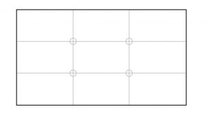
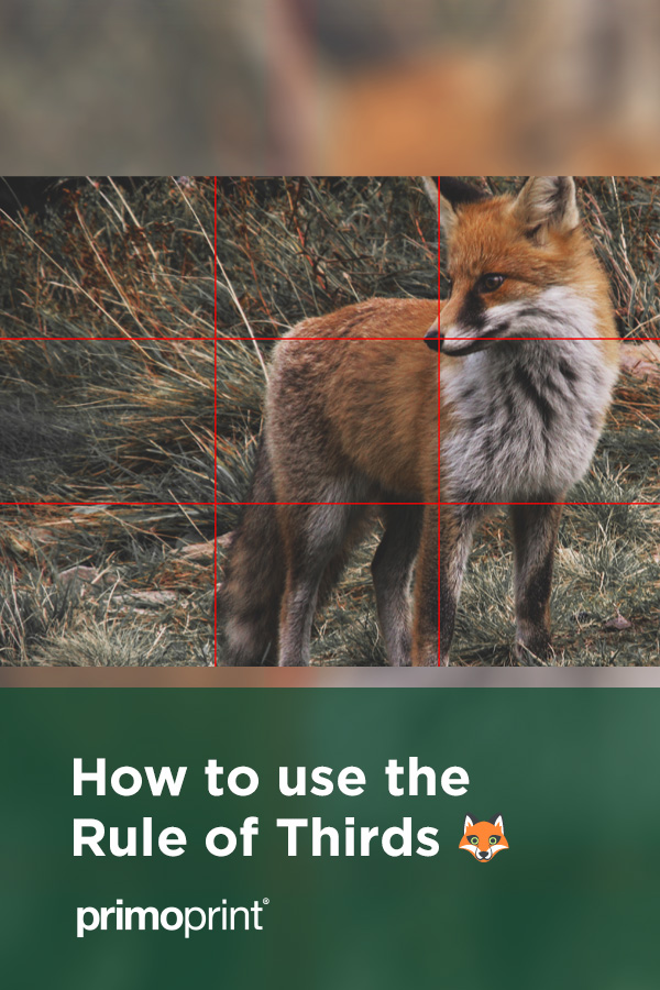
The rule of thirds grid divides the canvas into nine equal parts by two horizontal lines and two vertical lines. The idea is that the focal points of the design are placed where the lines intersect, creating an off-center composition. By doing so, it will create a more natural and pleasing visual since the design isn’t centered in the middle of the frame.
Below is a rule of thirds grid.

How to Incorporate The Rule of Thirds
Whether you’re using the technique for your next print design or taking your family’s picture, you’ll see the difference.
 As you can see with the above business card design, one picture cropped without and one with the rule. Placing a key visual element on the intersecting lines will draw the viewer’s eye to that element instead of going directly to the center.
Give it a Shot in Your Design
If you are not familiar with the rule, you’re more likely to see it everywhere now. Before you know it, you will have acquired an eye for a great design that can help you down the road.
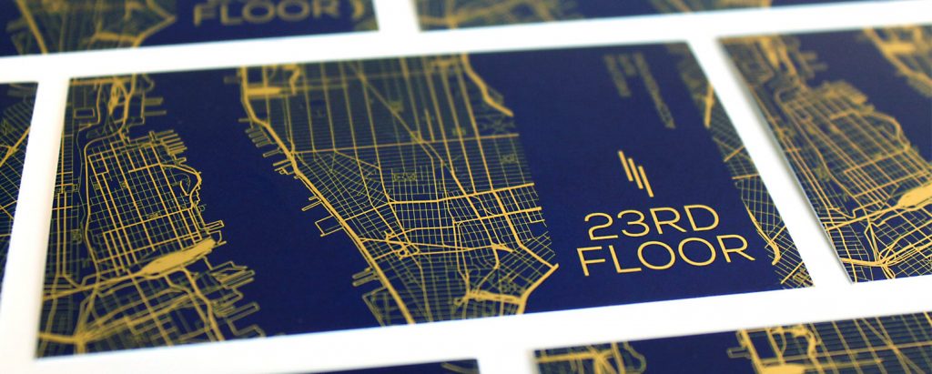
Below is an example of a business card incorporating the rule of thirds.

Creating a Rule of Third Gridline
Not familiar with using the rule of thirds? Follow the steps below to set up the rule of thirds gridlines.
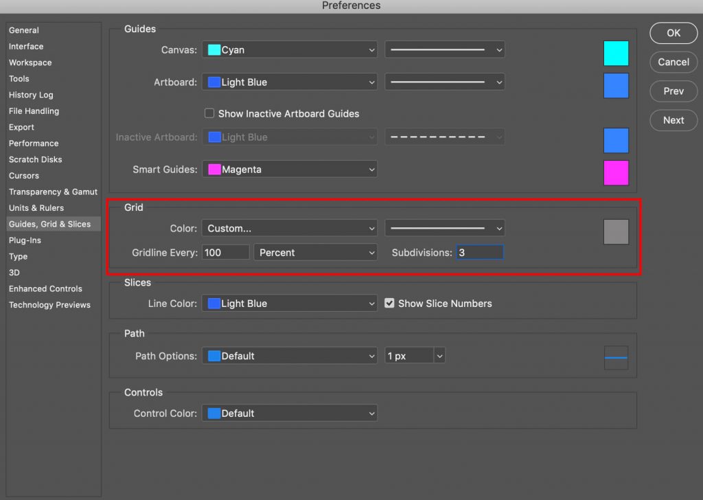
- Open Photoshop and go to preferences
- Once in preferences, select Guides, Grid, & Slices
- Change the menu option to Percent and “Gridline Every:” to 100
- Change Subdivisions to 3
- Click OK in the Preferences dialog box
- Then go to View > Show > Grid

The rule of thirds gridline should now be visible, allowing you to position your artwork.


