An existing design client of ours, Roberto, came to us for a new logo for his hair salon. He said he wanted a logo design that was modern and clean, with neutral tones for a salon providing services to all genders.
- Designer: Liza
- Project: Custom Logo Design
Background
In addition to a modern look that has broad appeal, Roberto wanted to incorporate a circle, square, and triangle to represent the cutting techniques they use as stylists.
Design Process
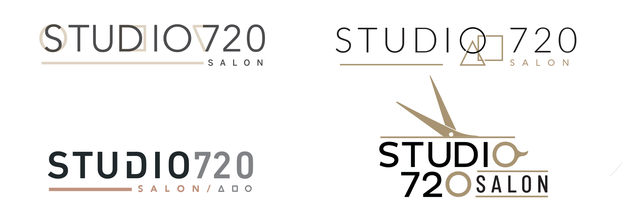
Roberto sent over images of a few logos he liked that had a similar look and feel. Inspiration images are always helpful to avoid misinterpreting the vocabulary used to describe styles, which can sometimes be subjective or have multiple meanings. The process involved creating 3 or 4 concepts using the three geometric shapes, except for the fourth, which featured a pair of scissors inspired by one of the examples he sent over.
The biggest challenge for me was in incorporating the shapes with the type so they would not appear random or cryptic to the general public, as likely only salon professionals would understand the meaning on a deeper level. The four logos below were the options presented.

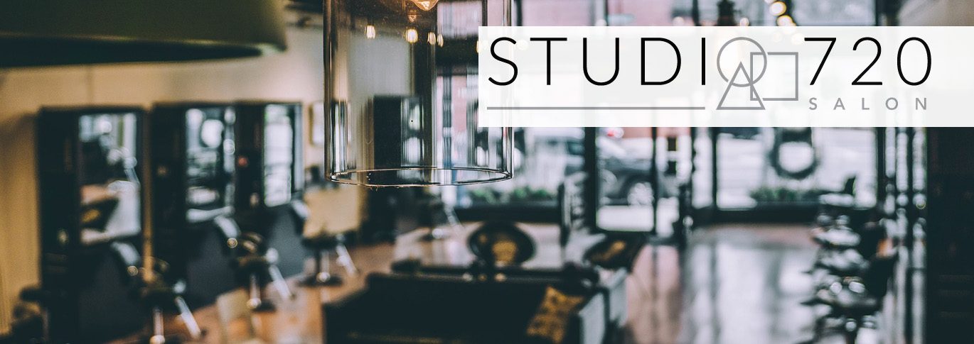
Once they identified the logo they liked best, option two, we made some adjustments to color and negative space, and voila, Studio720 Salon is born!

Are you looking to update an existing logo or have a custom logo created for you or your business? Our graphic design team will be happy to help.


