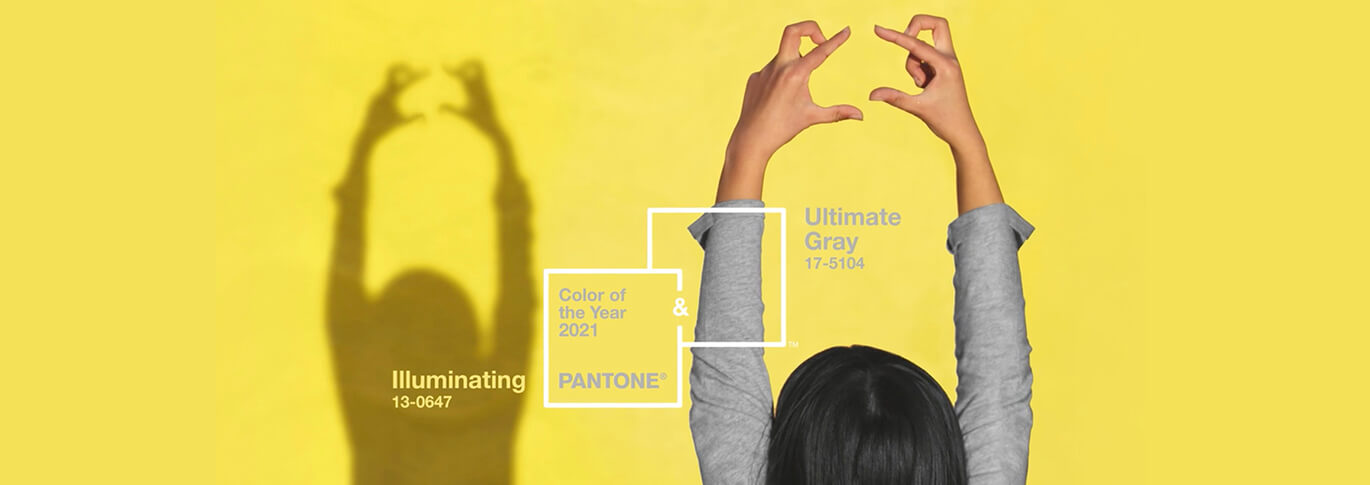
As 2020 came to a close, Pantone introduced their annual “Color of the Year.” This tradition has taken place since the year 2000. Companies from all over the world wait for the release of the color and apply it to their advertising.
According to Wikipedia, “Twice a year the company hosts, in a European capital, a secret meeting of representatives from various nations’ color standards groups. After two days of presentations and debate, they choose a color for the following year.”
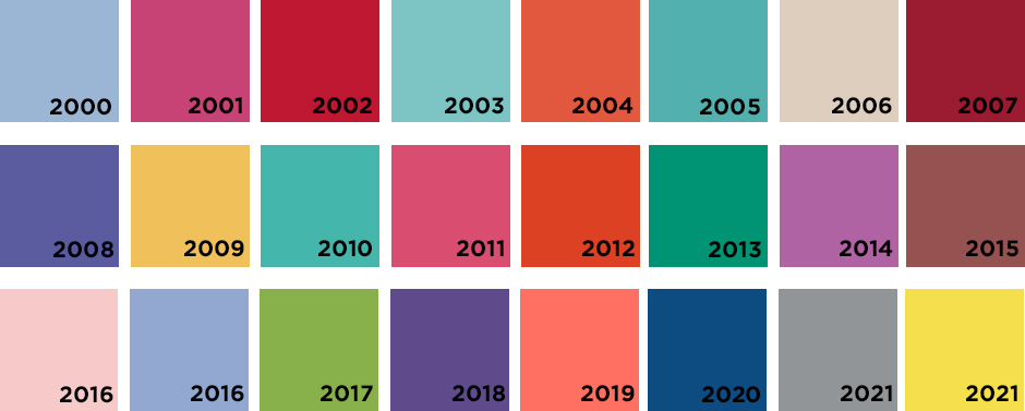
In 2020, the Classic Blue was chosen. Ironically, it was intended to instill “calm, confidence, and connection.” Little did Pantone know that 2020 would bring nothing of the sort. Despite the meaning behind it, this classic shade was found in advertising everywhere.

This year, Pantone has chosen two colors to represent 2021. This is only the second time in Pantones’ 21 year Color of the Year history. (The first time was 2016.)
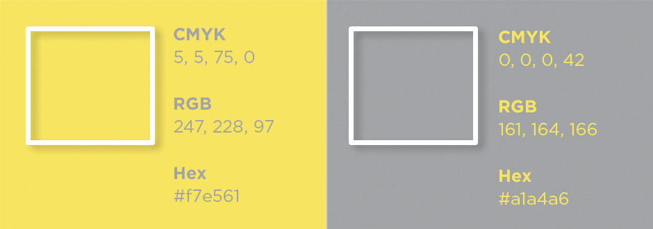
“PANTONE 17-5104 Ultimate Gray + PANTONE 13-0647 Illuminating, two independent colors that highlight how different elements come together to support one another.” – Pantone

Color has always been a determining factor on emotion. Thousands of studies have been conducted to determine which colors can persuade consumers to react in a particular way. While I tend to think of gray as a cold, sad color, it’s also known to instill balance and calmness. Bright yellow is more of a dancing-through-the-flowers kind of color but also represents optimism and warmth.
In 2016, both the pink (Rose Quartz) and light blue (Serenity) felt cohesive. This year’s Gray (Ultimate Gray) and Yellow (Illuminating) almost have competing forces. But this conflict is also one that may be extremely appropriate for the year ahead. With Covid-19 still on the rise, there is a lot of sadness in the world. Hopefully, with the use of these two colors, the people of the world will feel the strength, balance, and calmness yet to come. There is light at the end of the tunnel.
How Can You Apply the Pantone Color of the Year?
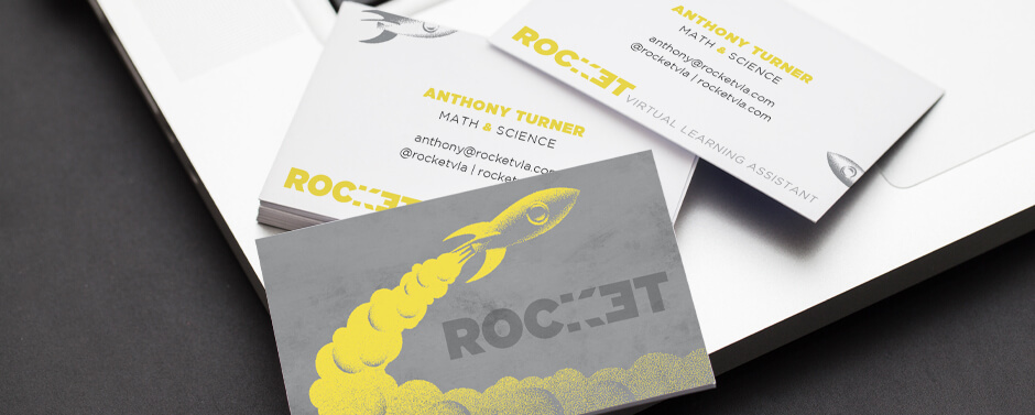
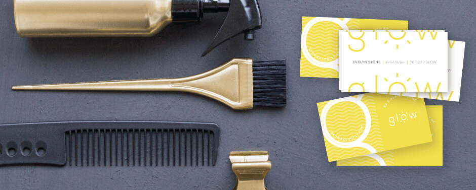
I would never recommend that you rebrand your company each year with the Pantone colors. And I’m not even suggesting that the color of the year is the only color that will resonate with your audience. But finding subtle ways to incorporate the colors into social media and other advertising may prove beneficial.
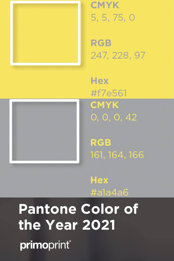
Helpful Hint: When printing with CMYK, don’t forget to convert the Pantone colors. Below is a breakdown of Pantone color to CMYK.
Interesting Bonus:
Pantone is not the only color company that supplies a “Color of the Year.” Many national brand paint companies do as well. And while interior paints may seem different from print, interior design, print, and even fashion trends go hand in hand. Here are a few more colors to keep in mind when planning your artwork colors.


