Each year Pantone announces what they call ” Pantone Color Of The Year”. This is a color that they feel represents the world in which we are headed. It tends to help set trends and companies from around the world integrate it into their marketing material. This year, we at Primoprint, have tasked each of our designers with coming up with their personal “color of the year.” This is a color that the designer feels is trendy and made a statement in 2024.
Alexis- 30,67,74,17
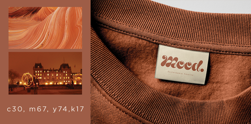
“I picked this color because It reminds me of the beauty of autumn. When it comes to designing or seeing them in nature, oranges, and browns give me a sense of warmth and comfort. This color provides me with a sense of warmth and tranquility, while also having the ability to evoke bold and intense emotions. The color’s versatility makes it suitable for various applications, including interior design, branding, and fashion.”
Brent- 81,80,0,0
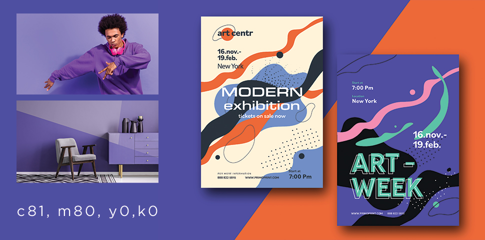
“The color violet is one of the oldest colors used in art and design. Traces of dark violet can be found in prehistoric cave paintings dating back 25,000 years. Throughout history, violet was adopted around the world for use in clothing, art, and design. Today the color violet continues to be used while invoking the calm elegance of human expression. The color can be contrasted well with sharp brighter colors such as orange, yellow, and pink.”
Mike – 23 100 98 17
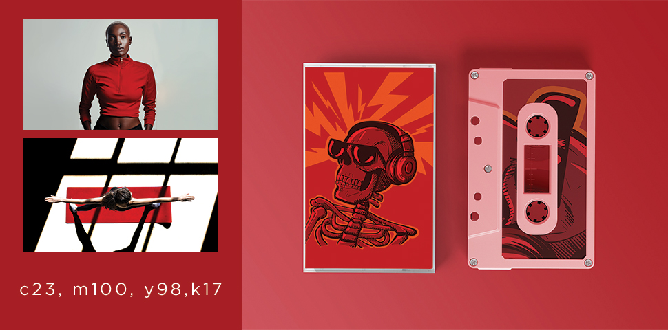
“2023 was the year of cool, muted colors and earth tones evoking a sense of calm. In 2024, I’m inspired by the bold, raw energy of this deep red. It’s a primal color signifying strength, power, and danger. The use of this color is intentional and unapologetic. It’s sure to attract the eye and add a bit of juice to any design.”
We’d love to know what you think of these colors or if you have your own ideas for 2024’s color of the year. Use #Primoprint on Instagram to show us what you’ve got!
Want to learn more about color and the best ways to incorporate it into your brand? Check out How to Unlock the Power of Color for Your Brand.

