It may be that time of year to review budgets, costs, and everything in between. In the restaurant industry, this is also the perfect time to revamp your menus. Whether adjusting prices, adding new seasonal dishes, or removing one that has faded out. Here are some tips to keep in mind.
Competitors
Check out what your competitors are doing. What is their menu offering, what does their menu look like? How are they displaying their seasonal or specialty dishes? Do they offer multiple menus: Wine, Liquors, Bunch, Lunch, Dinner, Dessert. Setting yourself differently from your competitors can make a huge impact on a consumer’s decision.
Categorize
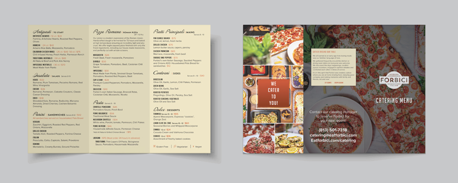
Almost every menu has categories. Whether it be Drinks, Appetizers, Entrees, Sides, or Desserts, be sure that your food item is in the correct category. For example, let’s say you offer cornbread as an appetizer and a side. Be sure that it is listed under each category.
Size
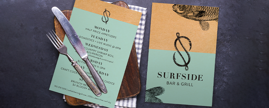
Ever been to a restaurant with an oversized menu and it was hard to hold and was flopping over as you were reading it? Be sure to have the correct size menu or have multiple menus such as Drinks, Lunch, Dinner, etc. Here are some sizes to keep in mind:
Lunch Menu: 8.5″x11″
Dinner Menu: 8.5″x11″, 8.5″x14″, or 11″x17″
Drink or Dessert Menu: 4.25″x11″, 4.25″x14″, or 5.5″x8.5″
Specials: 5”x7”, 4”x9”, or 8.5”x11”

Font
What type of customers do you normally have? If you have a majority of 55+, try using an easy-to-read large font. But if you have a majority of 20-50 explore your creative side and pick a font that best goes with your brand. Serif and Sans Serif fonts are going to be the easiest to read. Script and specialized fonts can be difficult to make out all of the letters, which can be frustrating as a customer.
Color
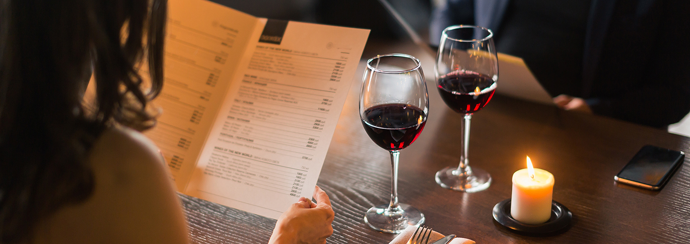
Color makes a huge influence on a consumer’s eyes. You want to make sure you always stick to your brand identity as much as possible, but also make sure the colors do not conflict with each other. You want to keep a high contrast between the text and the background. Let’s say you have a light blue background, you would want to stay away from lighter text as it is harder for a viewer to read. But if you went with a darker blue, the lighter text would really stand out. Also, keep in mind the lighting in your restaurant. If you have dim lighting, you will want to use a white or light-colored background.
Keep it simple
You might be able to make over 20 different dishes with all your ingredients, but less is more. Don’t crowd your menu, pick the top best-selling dishes and stick to them. Also remember that whitespace is good, Having too many options or too many photos will make your menu look cluttered and less visually appealing.
Descriptions
Probably the best part of a menu is reading all the different descriptions. But remember, customers also need to know what is in it to make sure they are making the best choice. And while it’s entertaining to give the backstory or use fun adjectives, don’t go overboard. Customers want to choose their meal fairly quickly.
Proofread
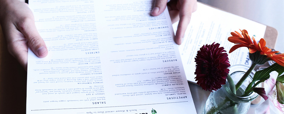
Believe it or not, mistakes happen often on menus and can be really embarrassing. The best method for proofreading is reading backward from bottom to top and allowing at least two other individuals not involved in the design and descriptions to proofread as well.
Menu Requirements/Laws
Different states have different laws in regard to menus. Be sure to check in with your state officials on any laws and regulations you need to follow for your menu.
The moment has come, you are ready to print your menus. But how many do you need? Here are some pointers:
Brunch- 75% of Your Seating Capacity
Lunch- 75% of Your Seating Capacity
Dinner-75% of Your Seating Capacity
Dessert-50% of Your Seating Capacity
Wine/Drinks- 25% of Your Seating Capacity
If you need a little help creating a menu, don’t worry about it. Our in-house graphic design team is here to help your restaurant grow – and to get your information out effectively and affordably! Reach out to us today to get started!


