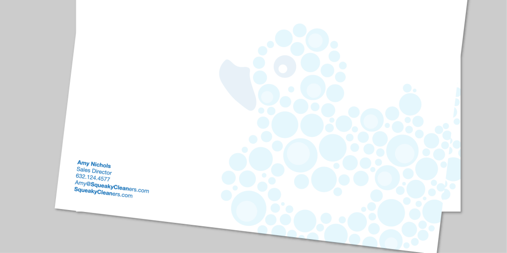
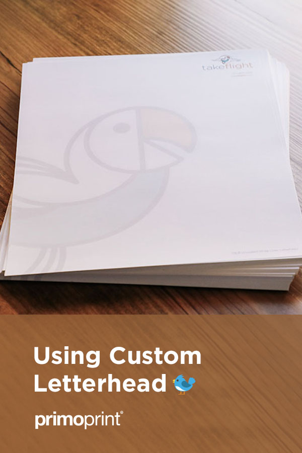
When it’s time to create a letterhead, a lot of thought and detail should go into it. Professional Letterhead is often one of the first points of contact with potential customers, making it one of the most critical printing collaterals in the business. Not only is it a form of professional correspondence, but it is a central part of your sales and marketing communications strategy.
Why is letterhead important? Below are just a few reasons why you and your business should invest in a premium letterhead.
It makes you seem easier to work with.
Not only do your potential customers want to know that a team is behind you, but they want to know they have access to a personalized contact. Customers don’t want things addressed by the company at large. This can be the difference between a customer who is loyal to the end and a customer who is always shopping for a better deal.
Increases Credibility
Personalized letterhead and custom stationery make your business look professional. In using it, you’re able to create a relationship with your potential client based on trustworthiness and reliability. Furthermore, it shows that you’re an established business.

Strengthens brand awareness
When a company has a high-quality business letterhead, one immediately assumes that it will provide a high-quality product or service. And if you have an ongoing company image—including a logo, business card, and envelopes—potential customers will notice the effort that you have put in. Furthermore, every company wants its customers to know that it offers the most affordable prices and the best service. Therefore, it needs to reflect this.
We asked our design team to provide some letterhead design tips.
Use the right software
It’s essential to make sure you’re using the right software. While Microsoft Word or Pages is acceptable for an ultra-simple layout, these will impose significant limitations when it comes to using graphics or more elaborate text layouts.
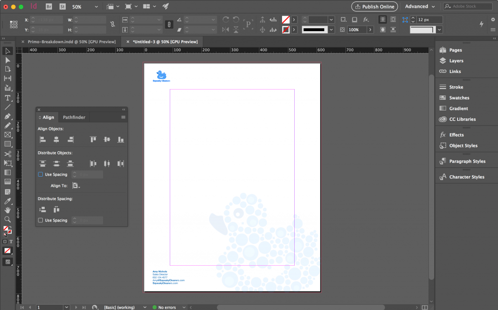
Adobe InDesign is probably the most suitable program for creating custom layouts, as it is tailored towards creating more flexible publishing layouts. Illustrator is also a great alternative when creating a single-page layout.
Consider alignment and positioning
In order to create a well thought out design, it’s essential to consider its size. The standard size varies depending on the region. If you’re sending a letter to the United States or Canada, you’ll want to set your page to US Letter size, which is 8.5’’ x 11’’. You’ll also want to think about the grid of your layout.
While letterhead isn’t as intricate as a magazine cover, it still needs a simple grid structure (where you break up the page into square or rectangle sections). It’s helpful to look at other professional ones and observe the grids they employ.
We also have a selection of free, certified letterhead templates for you to explore, ensuring an accurate production of your print job.

Adapt to your audience
It’s important to take a moment to pause and consider who you’re sending your letter to. You want your custom letterhead to match the tone of your company and for that cohesion to resonate with your recipients. For example, minimalist design is a perfect fit for a company that’s more traditional at its core.
If your letterhead vision isn’t coming together, you can always reach out to our graphic design team. We’ll be able to take your idea to the next level.
Are you looking for personal letterhead samples? Complete our sample request form, and we’ll be happy to send samples.


