You’ve just spent hours, days, or maybe even months creating the perfect design. You send it off to get printed, only when it arrives, the cards do not look like you had intended. As a designer, I know just how upsetting that is.
Incorrect file preparation is the number one reason why artwork does not turn out the way you want them to. So this week, I sat down with our Quality Assurance Team to pinpoint the top five mistakes designers make when submitting their files.
We’ll go over each mistake, explain the importance of it, and show you how to avoid this mistake.
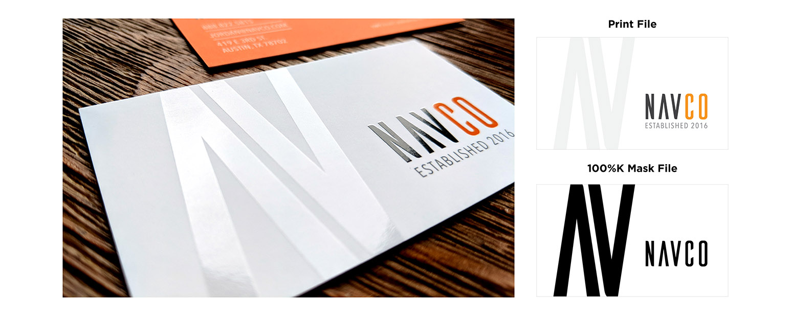
Mask Files Are Not 100% Black
When ordering Spot UV and foil products, a mask file is required. This is a separate file that tells the press exactly where to place the Spot UV or foil. All elements in the artwork should be removed (or turned to 100% white) except where you want the Spot UV/foil to be placed.
The press will search the file for a value of (0c, 0m, 0y, 100k). If there are other color values present, it will not know the correct placement. It’s also important to make sure your file does not contain a gradient. The black must contain a solid edge.
Mask Files Are Not Aligned Properly
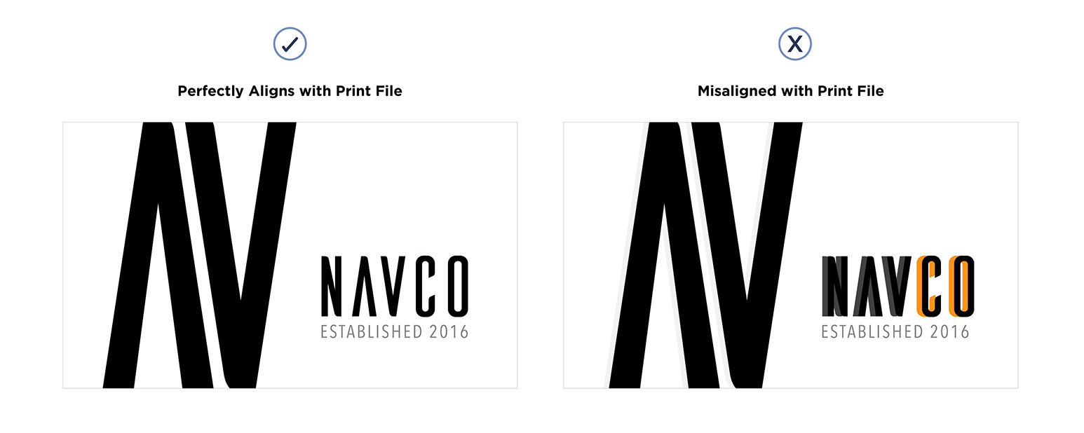
If you are placing Spot UV over the top of text or images, it’s important that the mask file lines up perfectly. The easiest way to do that is by duplicating your artboard, or layer, and changing the color to 100% black.
Then, lock its position. It’s very easy to accidentally move the object without even realizing you’ve done it. The press will put the Spot UV exactly where you tell it to and will not register if it doesn’t line up perfectly with the object below.
Files Do Not Contain Bleed
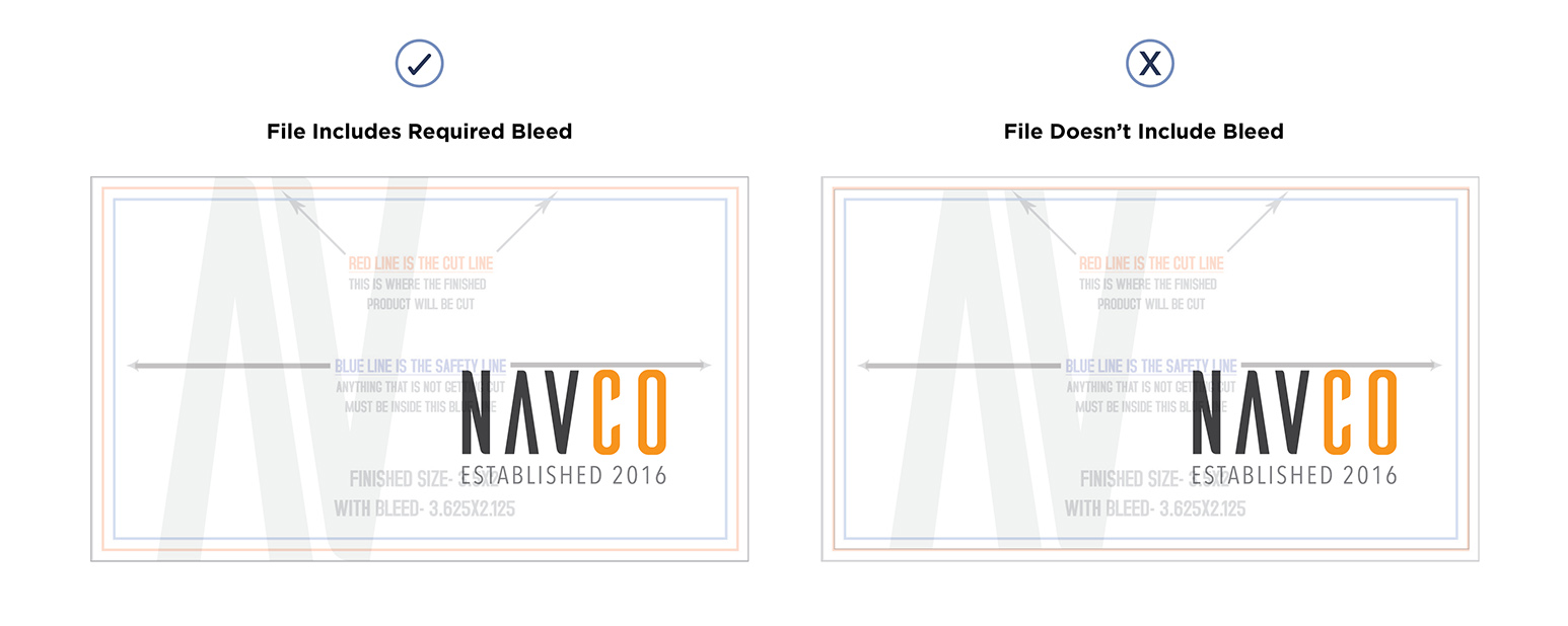
Adding bleed to your artwork is very important. This is where you extend your background past the edge of the artwork. The reason this is so important is that it ensures there will not be a white stripe visible along the edge of your card. This is from where your artwork ends and the white of the paper begins.
Every printer has different bleed requirements. Bleed can also differ between project types. Here at Primoprint, we ask for .0625 inches added to each side of business card files. For yard signs, as an example, we ask for a bleed of .5 inches on each side.
When setting up your artwork, it’s very important that you ask your printer what their bleed requires are for your project. Or, we have templates available for all products and sizes, that we print, available for free download.
Business Card Template Tutorial
This video tutorial will help you by making sure you start with correct dimensions including bleed and the proper CMYK color mode. We’ll also provide you with the guidelines needed to make sure you meet our production requirements ensuring you with the best print product available.
Not Enough Contrast
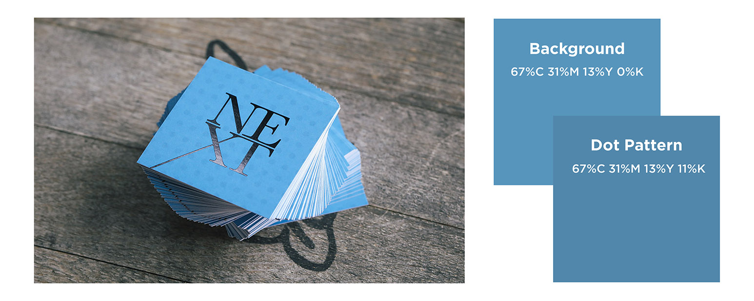
The first time we printed the Next Management card, I’ll admit, I messed it up. There are very subtle dots in the blue background. On screen, the dots were very visible. But when printed, I didn’t have enough contrast between the two colors for the dots to show up.
I had to adjust my print files and send the artwork back for a reprint. (See, mistakes happen to best of us!) A general rule of thumb is to make sure there is at least a 10-15% difference in color builds for a subtle appearance when printed.
I also recommend printing your artwork out on your desktop printer. The quality and color may not be as good, but at least you will have an idea if the contrast is big enough, or if the pattern will fade into the background.
Text Is Not Large Enough to Read
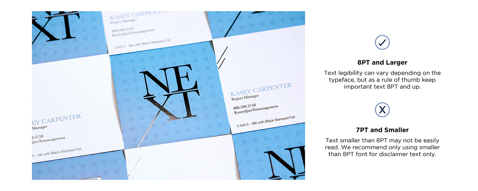
I am a big fan of simplicity and clean cards. I like the text to be more on the small side, so this is something I too have to be very cautious of as a designer. And it’s important to remember who your customers are. Older demographics tend to need the text a little larger than those in their 20s.
Plus, our computer screens are so big these days, that everything looks readable! This is another reason why I recommend printing out your artwork, prior to uploading the final files. If you print it out at 100%, you’ll get a much better idea if your text can be read by all your potential customers.
Each of these mistakes is easy to make and easy to fix. Before uploading any files for print, take the time to look them over carefully. Think about all aspects of the print and make sure you haven’t forgotten anything. Double check your color values, print the cards out and have someone else proofread them (one more item I didn’t mention!)
Sometimes another set of eyes can help you find an issue you may have overlooked. Taking this extra step will help you to have a better-printed piece every time!

