Who you are as a company, and how you choose to represent yourself are extremely important. This is where a Brand Manual comes in. Brand Manuals, also known as a “Brand Style Guide” or “Brand Guidelines”, are a visual representation of how you want others to see you.
Every time your logo and your company are in print or digital form, you should be following the guidelines set out in your Brand Manual. They are used by your company, but also for those using the brand externally.
This guide manual should be studied and used by every graphic designer, marketing professional, PR rep, etc., you work with (in-house, agency, or freelancer.) If a rule isn’t followed, you run the risk of presenting yourself in a way that will hinder your brand and company growth.
So what do you include in this Brand Manual? You can get as specific as you’d like with this style guide. Some companies have extremely strict rules. How their logo is presented, where the logo can be placed on a page, how far away other objects must be from the logo, how branded colors can be used, etc. Depending on your company’s size and reach, you may choose to have a tight rein or be a little more flexible on your brand representation.
In the purest form, you need to include four main areas in your Brand Guide. They are listed below with a few brand manual examples.
What’s Your Mission?
Start your brand manual with your mission statement. The statement is a sentence that sums up who your company is and what your goals and philosophies are. It’s crucial to present this at the very beginning of the guide because everything that follows needs to show that it supports your mission.
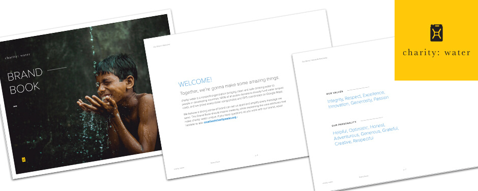
The “Charity: Water” Brand Manuel is beautiful and straightforward. This is probably the best brand manual I’ve ever come across.
They do a great job of explaining their mission and values. The entire manual is worth looking at, but for the sake of this topic, check out pages 4-8 specifically. They go above and beyond for their mission statement. It clearly states who they are and what they represent. You may choose to go the distance like charity: water or maybe a simple one-sentence will sum it up nicely for your business.
Focus on Your Logo
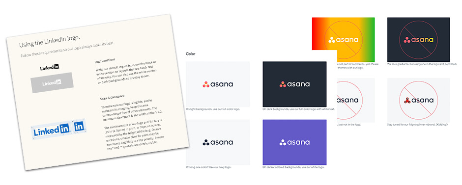
Show a representation of your logo. Provide examples, including how the logo should appear in color and in black and white. How much spacing is required between your logo and other objects? Also, show how your logo should NOT appear. Examples of color changes and squished or elongated logos are not acceptable for brand representation, and a visual of what that looks like can be helpful.
“LinkedIn” and “Asana” offer excellent examples of how their logos are to be used. They are very specific yet simplistic in their representation.
There’s Beauty in Color
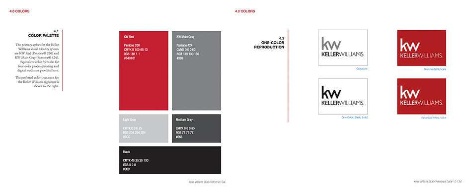
In this section, show color swatches of branded colors. These are the colors used in the logo. It also includes colors that may appear as a dominant feature in advertising. For each swatch shown, list the CYMK, RGB, Pantone (if needed), and Hex color breakdowns, so your designers will know how to match the color perfectly each time. You may want to divide your color palettes into primary and secondary colors.
Check out page 18 of the “Keller Williams” Brand Guidelines. The entire brand manual is an excellent example of how to properly layout the style guide, but here it shows the full-color breakdown and how to use the logo on top of the branded colors.
Know Your Fonts
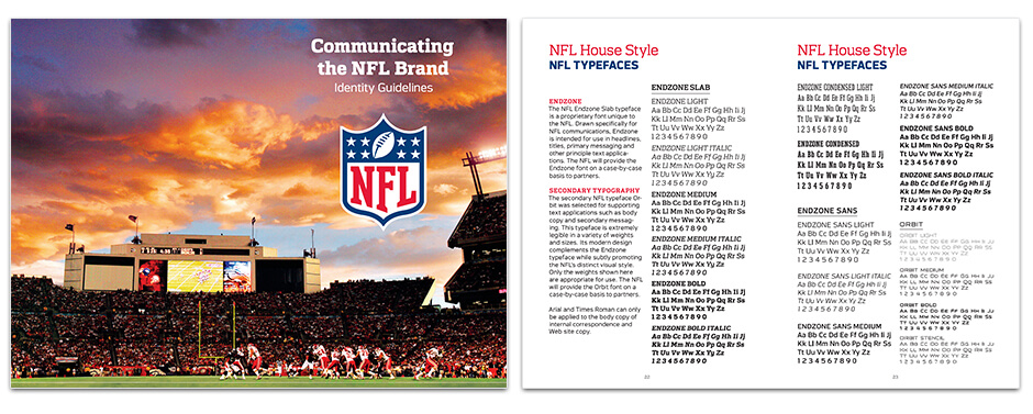
Within the manual, this is where you can list out the fonts used in the logo and fonts you would like used in all advertising platforms. For example, you can use one font for all headline text, a font variation for subheads, and a third variation for all body copy. Even small details like disclaimers and captions should have a branded font associated with them. By doing so, this helps all designed pieces to feel cohesive and elevates brand recognition.
The “NFL” has a very extensive Brand Manual. Check out how they list their fonts and usage. (Pg22-23)
But how your brand is represented doesn’t need to stop with these four elements. There are still plenty of topics that can be included in the manual.
Break Down Your Placement
Design pieces such as business cards, letterhead, envelopes, notecards, printed ads, web ads, etc. Where should your logo be placed on the page? Should the logo always appear in the bottom left corner, always on a white background? Should the website or tagline always be listed 1/4 of the logo height below the logo? How should the contact information be structured, and where should that information be listed?
Image is Everything
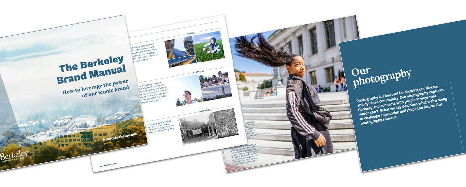
Is there a specific style for your photos? Maybe all of your photos need to be in black and white. Or perhaps they all need to include the branded color inside the image somewhere. Perhaps you want all product images to be displayed on a white background. Or, possibly you only want to use photos of real employees vs. models or stock photography. All of these specific photo requirements can be shown here.
“Berkeley” has a fantastic Brand Manual. They’ve created an extensive, 97-page manual that covers all things, Berkeley. Take a look at pages 54-55. They discuss three different photo themes and how each makes up who Berkeley is.
Find Your Icon
In today’s design, many companies are using icons. If there are specific icons or styles that your company uses on a day-to-day basis, it’s important to show examples of the required style.
“Uber” has a great example of how their company uses iconography.

The Brand Manuel has no limits. Don’t be afraid to set your company’s brand voice, tone, and make sure everyone upholds the brand’s integrity. And as your brand grows, make sure to yearly visit your brand guidelines to make any necessary updates and additions.
Does your business have a brand guideline or manual? What elements did you include? And how has the manual helped your business grow? Let us know!


