Working with a graphic designer can be exciting, but also a little daunting. To help not only yourself but your designer, a few preliminary measures and planning can make a world of difference. Here at Primoprint, we have our own design team that’s here to help with your design needs. Liza today will be giving you some tips on how to help your designer create you the best design.
Know Your Audience
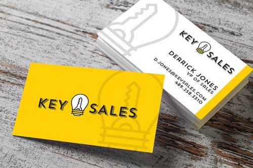
If you have an established brand, send over your style guide and website. Your designer can work within the established parameters to give you something that supports your other marketing material. Having brand recognition is something every business wants!
There are many graphic styles and creative directions out there to keep your designer guessing for days what yours is. If you don’t have a style guide or website, knowing your audience will help determine direction and style.
Sending examples of past material can also be helpful. If you don’t have past projects, or you want a new creative direction, send examples of other designs you like, and that fits your company values.
Helpful Resources:
- Primoprint Gallery:
Let us know any designs that interest you in our gallery. - Pinterest Board:
Create a board and share it with us. It’s a great way for you to share designs, colors, and typography that grabs your attention. - Google Image Search:
Find examples by searching Google.
Know What You Want to Accomplish
Each marketing piece has its own set of goals. The clearer your idea, the easier to write copy and convey the information to your designer with the end goal of achieving an eye-catching, cohesive piece.
Some Questions to Consider:
- Does this piece need a headline or call to action?
- Will you include an offer or discount?
- Are you marketing a specific product/event or seeking to elevate your brand?
- What sets you apart from your competition?
- Have you unnecessarily weighed the space down with too much information, thereby overwhelming the message and the reader? In design, less is often more.
Choose Stock and Finish Upfront
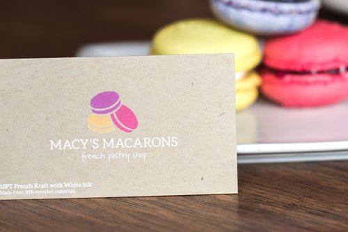
Have you ever designed the perfect piece on screen only to have it fall flat in print? Stock and finish play an essential role in the success of the final printed product. Making these choices before the design process begins not only helps to visualize the result better but allows you to discuss the pros and cons with your designer. They can offer up tips as to whether a specific coating, finish, lamination, foil, gloss, weight, or texture will be a good fit for your design.
Email Complete and Typed Out Copy
Once you know your message to your audience, you will want to supply this in a spreadsheet or write it directly in the body of your email for your designer to use. This significantly cuts down on time and increases efficiency for everyone while eliminating the risk of typos on the designer’s end, due to the potential of retyping incorrectly.
Send High-Quality Images
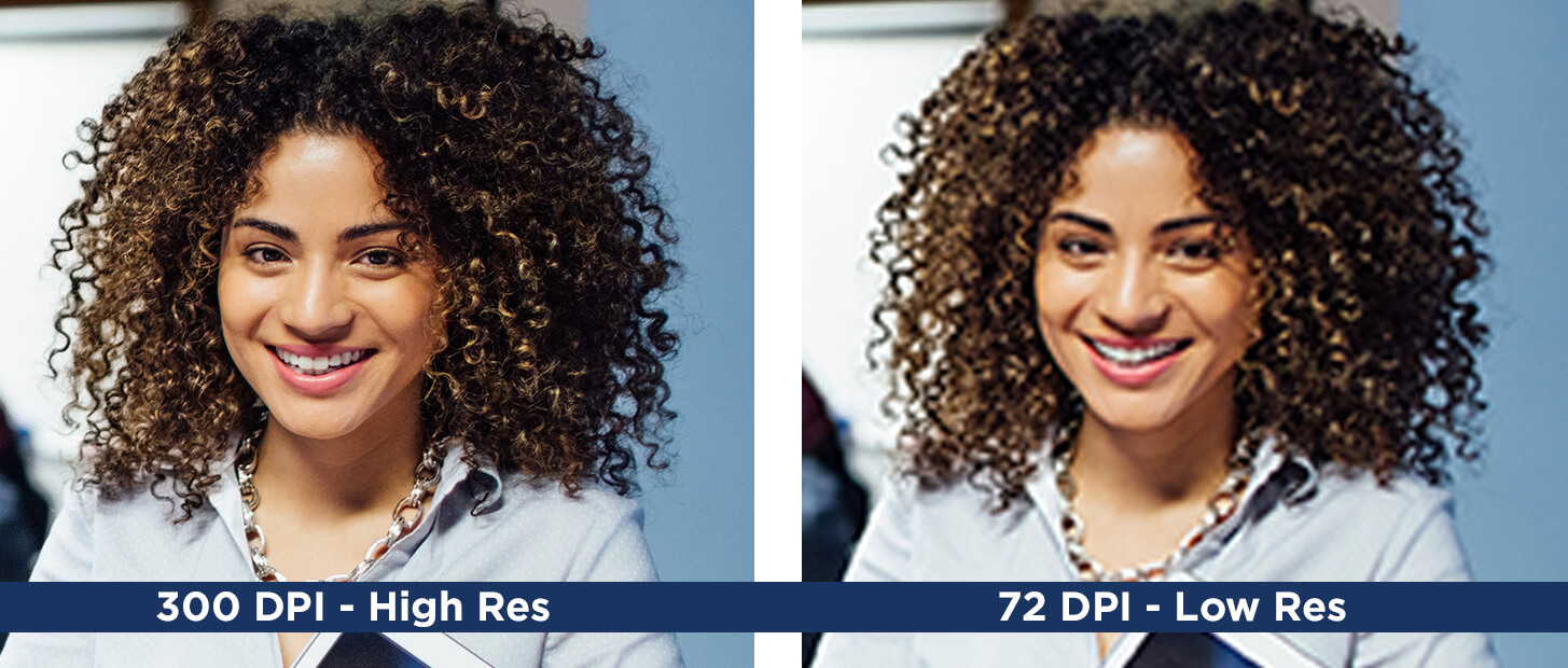
Know the difference between images that are fit for the web and those that will produce well in print. A resolution of 300dpi is suitable for print, and anything under that will start to lose quality and get blurry or pixelated.
Supplying your designer with high-quality logos, images, and photographs will make your job go faster and ensure a crisp and professional look. EPS, PDF, AI, or INDD files are considered working files/editable. Except for photographs and some images, you will not want to use JPGs as they are flat and not editable.
Give Your Designer Specific, Corrective Feedback
If you find yourself where the design is not working for you, or you would like to push it further, be sure to communicate with your designer as clearly as you can to keep moving forward. A communication breakdown can stall a project, leave them guessing, and confidence can be lost on both sides.
The more specific you can be in your feedback, the more your designer knows where to go next.
For example, ”The layout is working for me, but the tone needs to be more serious.” Try to avoid vague or subjective language such as, “It’s not quite right” or “I want it to look cooler.”
Or, elaborate on these statements; is it the color, tone, layout, photos, busyness, white space, text size, or lack of cohesiveness that isn’t working? What is working? Is the message coming across loud and clear?
The more you can pinpoint problem areas, the less likely miscommunication or guesswork will occur, a common culprit for taking a wrong turn.
Additional Design Resources:
- 10 Instagram Accounts to Follow for Logo Inspiration:
Are you looking for logo inspiration and not sure where to start? We’ve listed our top 10 accounts when it comes to finding the best logo inspiration on Instagram. - Tips for Aspiring Graphic Designers:
We asked our design team to provide some helpful design tips and advice that they feel will be valuable to anyone looking to start a career as a print designer. - Top 5 Print Tutorial Blogs:
It’s important to make sure your products are printed in the highest quality possible. Check out these print tutorial blogs to help get you started and avoid common print errors.
