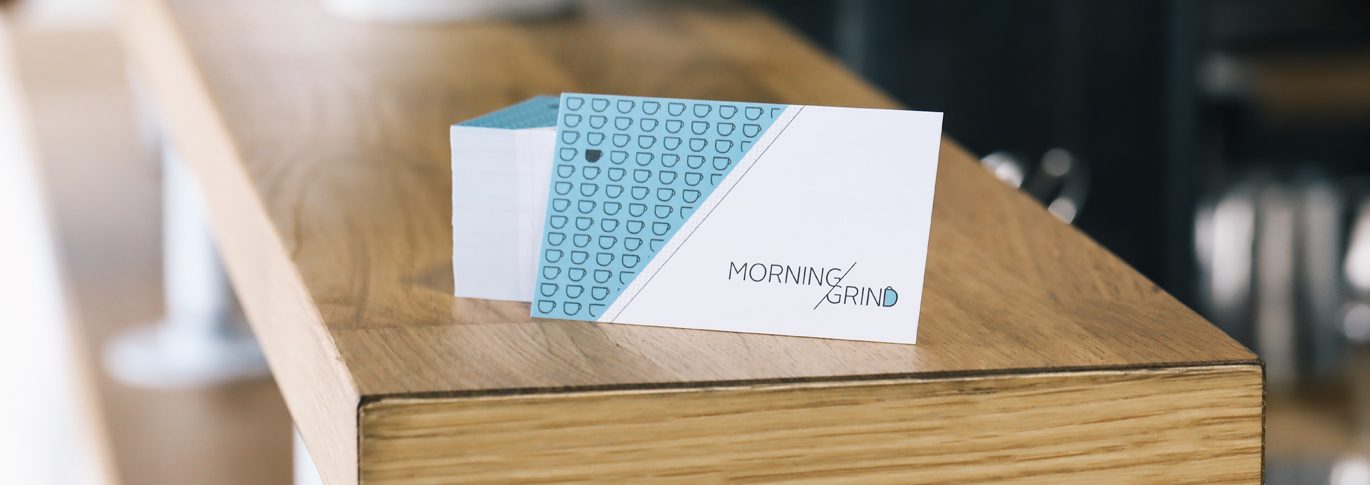
Having a well-designed business card functions as both a conversation starter and reminder of your brand. When asked, 72% of respondents said YES if they judge a company by their business card, That number is exceptionally high and shouldn’t be ignored.
Think about how many business cards your target audience receives while networking. How will your card stand out? These small 2″ x 3.5″ cards serve as a brief introduction about you, your business, products, and services.
Are you looking to get noticed? Below are tips on how your business card can stand out and get you noticed.
Brand Touchpoint
What is a Brand Touchpoint? It’s any communication or interaction made between a customer and a brand. You want to make sure that you provide the best brand experience!
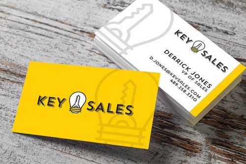
When a potential client comes in contact with your business card, they’re not only interacting with you but also your brand. It may be the first brand to experience a potential client has, so making the right impression is essential. Make sure the card is consistent with your website and other promotional products. This can be done by including your logo, tagline (if you have one), and brand colors. These are all vital to designing a great business card.
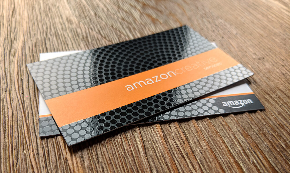
Card Stock Options
How do you select the best card stock for your business card? That’s the million-dollar question. There is so much more than having a creative design. Choosing a card stock is a crucial aspect of your card as it not only impacts how your card will look but also how it feels. Your card stock quality is a reflection of your company, product, and service.
Neuroscience studies show paper-based content & ads offer advantages in connecting with our brains, via @rogerdooley
We currently offer a variety of card stock options. Whether you’re searching for a thick card or a thin one, we’ve got you covered.
- 14PT
- 19PT
- 22PT
- 32PT
- 20PT Plastic Business Cards
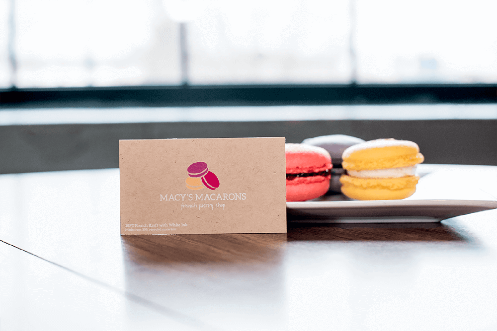
In addition to the card thickness, finish plays an important role too. Along with our traditional Matte, Glossy UV coated, and Silk options, we provide eco-friendly options. Our French Kraft and Natural card stock are eco-friendly as they both contain 30% recycled paper.
If you’re looking to show your company’s strength and durability, take a look at the 32PT Painted Edge business cards and The ModCard.
Layout is Important
There are a variety of sizes for business cards, but it’s best to use the standard 3.5″ x 2″ rectangle size. Die-cut cards are eye-catching but can be difficult to store. Designing the card with left-aligned text is the easiest to read, while centered text looks cluttered and can be more difficult to understand.
While it’s important to display your company logo, try not to allow it to overwhelm the front of the card or put it too close to the edge. You’ll want to make sure it stands out from the text. If choosing to include borders or lines, be careful with cutting as it could make the cards look uneven or crooked.
Necessary Text
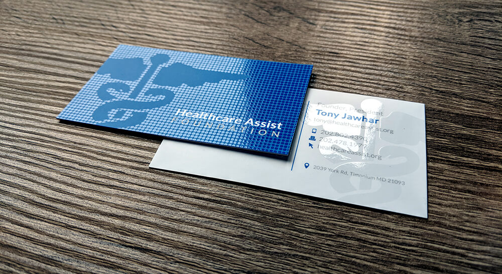
When designing your business cards, think carefully about what information you want to add. Try to include the best ways to reach you.
For example, If you prefer to be contacted via email and your mobile number, consider not listing your office number. By doing so, this makes it easy for people to reach you and eliminates unnecessary information from your card, keeping the design simple.
You wouldn’t want a potential client to leave a voicemail on your office phone that never gets answered. If you choose to include multiple phone numbers on your card, label each one.
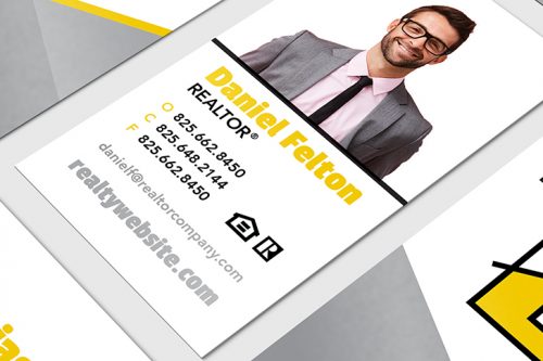
Are you available to answer questions and inquiries via social media? If so, adding Facebook, Linkedin, YouTube, and other social icons on your card provides clients where to find you. Only include the platforms you consistently monitor. Different types of text to think about, including job title and business slogan. Keep in mind that your business card isn’t just about handing out, but it’s also about retaining the information.
Selecting Typography
Once you know what text you want to include in the business card design, you get to choose how it will look! You’ll want to select the size, font, and color. Sometimes it is not the message, but how it is said, that makes the most impact.
Not sure which font is best for your print project? We’ve listed some tips on how to pick a font that will help your print project stand out and get noticed.
Readability is Essential
Using unique and “fancy fonts” are not meant for a printed business card. Try to keep your fonts simple and large enough to read at a glance. Using no more than two types of fonts is important. Choosing light print on dark colors is particularly hard for some people to understand, so using neutral colors with black, dark blue, or grey print is preferable.
Make sure you try to keep the front free of clutter, by displaying only the basics: name and contact information. If you have additional vital information, place it on the back of the business card as this can include social media profiles and other company information.
Websites and QR Codes
If you have an online presence, including your website, is crucial. Regardless of how and where you do business, adding your website is important. It gives customers the ability to research your company on their terms.
Including a QR code within your design is a simple way to make your card look more modern. The code that once seemed obsolete is back, and people are actually scanning them…a lot! Including a custom code is an easy way for viewers to access your website or landing page quickly.
Physical Mailing Addresses
The choice to include a physical address on your card depends on the type of business you have. If you have an online business or business doesn’t occur in person, including your physical address is unnecessary. If a client needs it, they can always ask.
All brick and mortar businesses should include a physical address. That way, potential clients can easily find you. For example, a restaurant manager would always want to add the location of their business on their cards.
Business Card Sizes
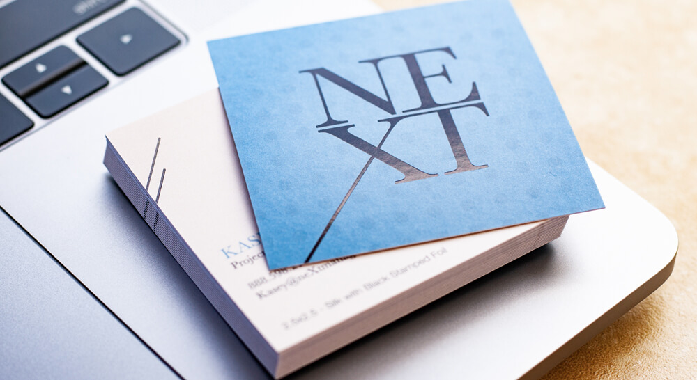
Traditional US business cards measure 2” x 3.5”. An easy way for your card to stand out is to choose a non-traditional size. Square shaped and mini shaped cards are a great way to stand out among the sea of standard cards that someone receives while attending an event or conference.
- US Standard Size: 2″ x 3.5″
- European Size: 2.125″ x 3.375″
- Square Sizes: 2″ x 2″ and 2.5″ x 2.5″
- Mini Sizes: 1.75″ x 3.5″ and 1.5″ x 3.5″
- Folded: 3.5″ x 4″ with Scoring
Special Features
Now that you have selected your card stock, typography, contact information, and size. It’s time to make your design stand out and get noticed. Let the fun begin!
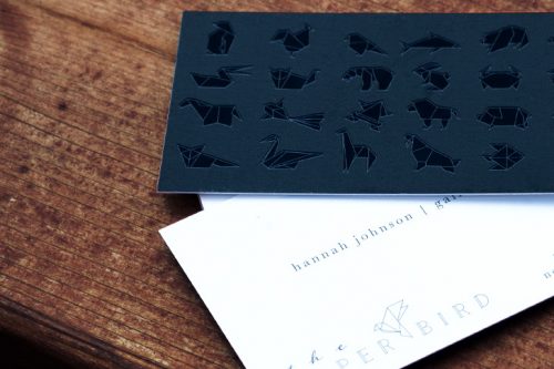
Select unique print features like Spot UV gloss or Foil stamping can amplify your design and help your cards, making a lasting impression. Spot UV refers to the application of UV coating to specific areas of your design. This can include images, logos, graphic patterns, or text. Along with Spot UV, you have the option to select Raised Spot UV.
Foil printing enables you to select parts of your design to be shiny, similar to a reflective foil. Make your font stand out or graphic with stamped foil.
Other options include Inline Foil, rounded corners, painted edges, and more.
Request a Free Sample Pack
So, it’s time to work on your business card design. Before you get started, request a free sample pack to see our various stocks and finishes firsthand. Take a look at the items included in the sample pack.
If you would like some assistance, our experienced in-house design team is here to help!
